Showing posts with label Art. Show all posts

Monday, February 9, 2009

The Justice of Proportions

Previously, I posted some proportional studies of male and female figures. Male HERE and female HERE.

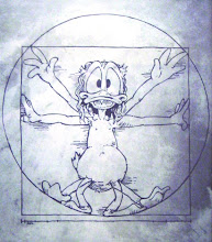
People fall within a range of proportions. Men can range from 7:1 on the squat and robust end, to 9:1 on the attenuated end (this proportion is reserved for adolescent boys and delicately proportioned men) Women can range from 8:1 on the more full-figured side of the scale to 10:1 for adolescents and very ethereally proportioned girls. Why the importance? Because if you're trying to draw a matronly lady you'd proportion her at 8:1. A barrel chested farmer who has spent his life working in the fields would be 7:1. A vestal virgin would be 9 1/2 or 10:1, while the effeminate and lisping Alcibiades would probably be well represented by an epicene body that is 8 1/2 or even 9 heads high--it all depends on what you're trying to represent to the audience. One thing is clear... Alcibiades at 7:1 wouldn't be right.

All this doesn't take into account the proportion of children which never meet the mark of adults--a phenomenon found in the higher mammals known as allometric growth--they start out in life with a head 25% or more of their body length, and then gradually stretch, becoming overly attenuated at adolescence before they elastically snap back to the overall proportion of maturity they'll maintain until old age, at which time they head back to, well, 0:1.


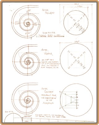
What is being set up here is a set of 'keys' for architectural design. There are 5 basic keys in the ordering of architecture. In fact, they are called the 5 'Orders', and many of you just call them the different kinds of classical columns. They are, in order of robust and non-sculptural to attenuated and highly ornamented, Tuscan, Doric, Ionic, Corinthian, and Roman (sometimes called Composite). Above is a parallel of the orders I drew comparing the orders to each other, keeping the height static and the lower diameter, or modulus, variable. How are they related to the human figure? Because the classical orders, anthropomorphic in origin and symbol, share the same basic proportions as the range of human figures. The Tuscan is 7:1, the Doric 8:1, Ionic 9:1, while Corinthian and Roman are 10:1, but differ in the amount and delicateness of ornamentation. Note that along the scale there is no ornamentation on the Tuscan (who's heard of a country farmer wearing jewelry?) All the way up to highly ornamented in the effeminate range of Corinthian and Composite.

Now, back to why they're called 'Orders'. They are given this name because they give order, they modulate the style, proportion and ornamentation of, the architecture. This is most clearly understood when it comes to building typologies. While it would be fitting for a Theater, the function of which is delicate, entertaining and frivolous to be in the 'key' of Corinthian or Composite, it would be an altogether misleading impropriety for a bank to be of such an order, given that it needs to project the ideas of sturdiness, lastingness, and impenetrability. So too, when choosing the order for a certain church dedication: It would be fitting for a church dedicated to St. Paul to be ordered with the Doric order, as he was a strong, princely figure. But to choose Doric rather than Composite for a church dedicated to St. Therese of Lisieux would be to represent the girl rather not as a little flower but as a douglas fir.

Granted, this is modulation 101, and while architects can most certainly change 'keys' within one piece of art in the same way as Bach does in his music, we nevertheless have to learn the basics first, or you designers out there will totally screw up your façade, also known as façadomy. This is often why I'm so frequently losing my temper at idiotic uses of columnar elements in McMansions and the like. Contemporary architects are ruining a perfectly good and clear symbology when they slap up a Tuscan column here, a Corinthian there, an Ionic around the bathtub, just for the 'look at me I'm wealthy factor'. Heck, in the majority of designs, you don't even NEED a column for the Order to be present, but rather the proportional and ornamental principles ought be present in all features and done in a commodius manner, and never for a Mannerist commode, as one would find at Mike's Marbleopolis:

Sunday, January 4, 2009

Dominic


Links to the other boys in this series of portraits here: JAMES, DAVID, MARK, SEAN

Saturday, January 3, 2009

Sean


Links to the other boys in this series of portraits here: JAMES, DAVID, MARK, DOMINIC

Friday, January 2, 2009

Mark


Links to the other boys in this series of portraits here: JAMES, DAVID, SEAN, DOMINIC

Thursday, January 1, 2009

David


Links to the other boys in this series of portraits here: JAMES, MARK, SEAN, DOMINIC

Wednesday, December 31, 2008

James

Over the next 5 posts (with maybe some others between?) I'm going to share portraits commissioned by a friend as Christmas gifts for his wife: charcoal portraits of each of their 5 boys. Each is 9"x12". To see them at larger scale, click on the image. I'm posting them here for three reasons. Firstly, because I'm hoping some of you like them so much that you would like the same of your kids, your nieces and nephews, grandkids, parents, crazy uncle Sal, friends, etc. and therefore would like to commission one or more of your own; secondly because I would really like constructive feedback so that I can get better. Please feel free to give your honest opinion in the comments section about which ones you like/dislike and why or what aspects you think I should work on; and thirdly because, well, no matter how badly I draw, I still I draw better than I write, so now I'll shut up.


Links to the other boys in this series of portraits here: DAVID, MARK, SEAN, DOMINIC

Monday, December 22, 2008

Flight into Egypt

Here is installment number 2 of 'Art I made for Maria'. In this sketch, Maria was the (unwitting) model for a version of the 'Flight into Egypt'. Well, I used her face and head, which is an age old tradition anyway. I apologize for the poor quality of the image, but I had to take a picture of it since I don't have a scanner big enough to import it in one pass.

Ordinarily, I'm not very fond of over-explaining my drawings and paintings, because they ought to stand alone, but I've promised a couple friends to describe my process of going about doing a piece, so here we go:

Generally, I'm more of a fan of an active fleeing when it comes to versions of the Flight into Egypt, in contrast to the more familiar 'Rest on the Flight into Egypt' such as that by GERARD DAVID (which I nevertheless have a version of hanging in my living room, because it's so symbolically rich and quite beautiful).

Nevertheless, I prefer the active versions of the flight because they portray the urgency with which the Holy Family had to act- both urgency and motion being a sign of the human realm, rather than the leisurely calm found in the 'rest' versions-lack of motion itself being a symbol of the divine. (Middle term: I prefer to think of the Holy Family in terms of their very regular, human life. Just a personal preference.)

However, in this version, I tried to impart the idea of both Human and Divine characteristics using these aformentioned action symbols of Mary and the Christ-child. Clearly Mary is on the move, her robes and hair being caught in the draft of her kinetic rush from left to right (read left=sinister, right=virtue, so that she moves away from sin: sin being an opponent that will forever try to ensnare her but will never catch this immaculate one) -you can almost sense that Herod's men are upon her as she hurries away.

Yet, her face is serene, full of the confident certainty that can only come with the knowledge that God would care for his Son, who is Himself so calm so as to suck his thumb in peace; for no ill will come of the situation. Moreover, His grace is full within her, and will keep her safe from the opponent sin which chases after her.

There is a baroque tension here between those two simultaneous actions: resting and moving. And as I am wont to say in the practice of architecture: if it's not Baroque, fix it.

My version is based very loosely on, and intended as an homage to, John Singleton Copley's work "THE DEATH OF MAJOR PEIRSON". The woman on the bottom right of the painting, as you can doubtless tell, was the figural model for my sketch in composition and massing, and interestingly enough, it was Copley's own wife and children who were the models for his own work.

I can't leave without drawing attention to the proportional tickmarks...left there just to prove to those few of you who doubt it, that my wife has absolutely perfect proportions.

Friday, December 19, 2008

I Love My Wife

Today is our 10th anniversary. And her 30-something birthday. So you might guess that with Birthday, Anniversary and Christmas all within a week, there's a lot of gift pressure. This is the year of art (Read: I'm a cheapskate and yet need to come up with cool gifts to reflect how much I love her), so here is installment number 1 of 'Art I made for Maria' (Click on it to get the full effect):


I love you, babe!

Oh, and it's not red because she prefers peach roses to red.

Oh, and Brian...the centroid of the rose cuts the composition of the whole into mean and extreme ratio.

Thursday, December 11, 2008

Classic Blunder

OK, first, think this:
Ha ha! You fool! You fell victim to one of the classic blunders! The most famous is never get involved in a land war in Asia, but only slightly less well-known is this: never go in against a German when language is on the line! Ha ha ha ha ha ha ha! Ha ha ha ha ha ha ha! Ha ha ha...
Then, read THIS

I think the only not funny thing is that stupid kids might just go back to getting tasmanian devil tattoos out of fear of getting something other than intended written on their neck. And I was so happy when the looney toons tattoo fad ended.

H/T Meg & Fr. Barry

Friday, December 5, 2008

My Awesome Kids

Monday, November 17, 2008

8 1/2 Heads High

In my LAST POST, I showed that the male figure is generally 8 heads high. While the general rule of thumb for figure drawing is that the whole body is 8 heads high, male or female, I would take issue with this. Today we look at the proportions of women...and note the female figure is 8 1/2 to 9 heads high. (This one drawn at 8 1/2 to 1)


Of course, all people fall within a range of proportions. And these variances of proportion can carry different connotations, meanings...

Saturday, November 15, 2008

8 Heads High

By Ray Gunner's request, and since I've not been writing regularly, but have been drawing instead, I'm going to post some of the sketches I've been working on. Lately, it's been proportional studies of the human figure, where I'm trying to learn the (almost always) simple whole number ratios that govern the relationship of parts of the body. In this case, the male figure is shown to be 8 heads tall (taking the figure's own head height as the modulus/unit)

Friday, November 7, 2008

Within the Framework of Boundlessness

I'm seeing a lot of art nowadays in museums and for sale that is frameless. Well, it's not exactly frameless, it's GALLERY WRAPPED.


A gallery wrap is usually chosen by young people and it is often use for modernist paintings rather than classic style painting. Even when a 'classical' theme or style is utilized, a gallery wrap will give a contemporary feel. There are 2 major benefits for using a gallery wrap, the first is the price which is much cheaper than a classical frame. The second is the weight which is much lighter in compare to any other frame style. The downside of a gallery wrap is that it can be used only for oil paintings and for acrylic paintings. These are the two major mediums that are painted on canvases that remain stretched on wooden bars (the underframe). Watercolor washes, Charcoal & Pencil drawings, and Pastel paintings are usually done on different kinds of papers which don't lend themselves to this kind of wrap. Additionally, these papers need glass, which is difficult to impossible to pull off when there's no outer frame.

All this being said, I am not a believer that all design decisions are economically based. While it's true that it has become very common to print photographs on canvas and then gallery wrap them because it makes the print editing process easier and cheaper, and many undiscerning beginners paint this way because they fail to ask themselves why they're doing it, there is nevertheless an ideology at work here and I'm going to take a stab at describing it.

Modernist artists don't like boundaries. They don't like being told that their art should be confined within a certain framework, because they see the metaphorical distinction of a cosmological view which determines reality within a 'framework ' of known or at least understandable principles.

Simply put, modernist artists don't want to give the impression that they are saying "look at this particular scene", which is what happens when a piece of art is conventionally framed. What they want to say is 'The subject or mode of representation of art should have no boundaries, so my piece of art should not have boundaries. The sides and back of the painting are just as important as the front, even if you can't see them'.

So the next time you see a gallery wrap, know that it's tipping its hat to modernist cosmology.

Saturday, October 11, 2008

One Last Thought On Modernist Architecture

No matter how hard you push the envelope, it's still stationery.

Friday, October 10, 2008

Missing the Middle (or Central) Term

In reference to my happiness over the location of the tabernacle in the Cathedral of Christ the Light, a misinformed reader commented that:
"...the 1967 document Eucharisticum Mysterium, section 53 advises the placement of the tabernacle in a separate chapel."
This is absolutely false. Actually, it's almost true, which is a special kind of falsity. This is indicative of the kind of misreading of texts that has lead many to misunderstand the wisdom and beauty of the spirit and letter of the Second Vatican Council, yet this kind of mishandling of the real intent is so widespread that people often take it for fact without second thought. So the question is, do you know where the tabernacle belongs in a church? Even the most orthodox often get confused in their answer. So if you're interested in my take on the Church's stance, read on.

The actual TEXT (including the context of the whole section on The Place for the Reservation of the Holy Eucharist):

52. The Tabernacle
Where reservation of the Blessed Sacrament is permitted according to the provisions of the law, it may be reserved permanently or regularly only on one altar or in one place in the church. Therefore, as a rule, each church should have only one tabernacle, and this tabernacle must be safe and
inviolable.

53. The Blessed Sacrament Chapel
The place in a church or oratory where the Blessed Sacrament is reserved in the tabernacle should be truly prominent. It ought to be suitable for private prayer so that the faithful may easily and fruitfully, by private devotion also, continue to honor our Lord in this sacrament. It is therefore recommended that, as far as possible, the tabernacle be placed in a chapel distinct from the middle o
r central part of the church, above all in those churches where marriages and funerals take place frequently and in places which are much visited for their artistic or historical treasures.

54. The Tabernacle in the Middle of the Altar or in Some Other Part of the Church
"The Blessed Sacrament should be reserved in a solid, inviolable tabernacle in the middle of the main altar or on a secondary altar, but in a truly prominent place. Alternatively, according to legitimate customs and in individual cases to be decided by the local Ordinary, it may be plac
ed in some other part of the church which is really worthy and properly equipped.

"Mass may be celebrated facing the people even though there is a tabernacle on the altar, provided this is small yet adequate."

55. A Tabernacle on an Altar where Mass is Celebrated with a Congregation
In the celebration of Mass the principal modes of worship by which Christ is present to His Church are gradually revealed. First of all, Christ is seen to be present among the f
aithful gathered in His name; then in his Word, as the Scriptures are read and explained; in the person of the minister; finally and in a unique way (modo singular) under the species of the Eucharist. Consequently, because of the sign, it is more in keeping with the nature of the celebration that the Eucharistic presence of Christ, which is the fruit of the consecration and should be seen as such, should not be on the altar from the very beginning of Mass through the reservation of the sacred species in the tabernacle.

56. The Tabernacle in the Construction of New Churches and the Adaptation of Existing Churches and Altars
The principles stated in nos. 53 and 55 ought to be kept in mind in the building of new churches.

The adaptation of existing churches and altars may take place only according to the principles laid down in no. 24 of this instruction.

57. The Means of Indicating the Presence of the Blessed Sacrament in the Tabernacle
Care should be taken that the presence of the Blessed Sacrament in the tabernacle is indicated to the faithful by a tabernacle veil or some other suitable means prescribed by the competent authority.

According to the traditional practice, a lamp should burn continually near the tabernacle as a sign of the honor paid to the Lord.

The particular text which is in question is this: "It is therefore recommended that, as far as possible, the tabernacle be placed in a chapel distinct from the middle or central part of the church"

To spell it out, this does NOT mean that a separate Eucharistic Adoration Chapel is required. What is required is that it be truly prominent and given due respect within the framework of the hierarchical arrangement of the liturgical furnishings, is capable of keeping the Body of Our Lord safe, and yet does not become a distraction or hindrance to participation within the framework of the Liturgy of the Eucharist (by physically getting in the way, or by calling too much attention to itself out of proportion to the rest of the sacred furnishings esp. the altar).

Part of the confusion is determining what is actually meant by "distinct from the middle or central part of the church". Just in case paragraph 54 didn't already clarify things, I submit to you some diagrammatic doodles to illustrate what is meant by paragraphs 52-54 in spirit and letter (and by extension, what is not intended) Click on the images to enlarge them.


And just in case anyone has difficulties moving from the universal to the particular, here's the same idea using a traditional cruciform plan and the plan from the Cathedral of Christ the Light.


Placing the tabernacle in the middle or central part of the church creates a physical and visual obstacle to the altar, places disproportionate prominence upon it (makes it appear more important than the altar), and can create an unsafe situation should someone come along and want to do harm to His Body, not to mention that it gets in the way of processions especially those in weddings and funerals (Sorry, Grandma, but we can't get Grandpa's coffin to the altar because Jesus is blocking the way). And since these things are what Eucharisticum Mysterium is trying to prevent, this scheme should and must be avoided.

Placing the tabernacle outside of the church is satisfactory because it keeps the Body of Our Lord safe, and also allows for private and intimate adoration, and obviously doesn't get in the way. But because only one tabernacle is allowed, this scheme is lacking because the prominence of the place of reservation is lost or diminished at best. Often because of renovations, this means that reservation takes place a great distance from the altar, and this is unfortunate because the altar and tabernacle should be visually and spacially linked to reinforce the fact that they are metaphysically and theologically connected.

Placing the tabernacle along the perimeter of the church but axially centered is best because all of the requirements are met. In an axially or linear plan, this is best along the major axis, in a radial plan this is not as important, but the geometry of the plan should help dictate the best location.

So you see, misreading the text (either purposefully or accidentally) of the directives of Vatican Council II and other pertinent documents of the Apostolic See can be detrimental, because mistaken liturgical design consultants use that misinformation to (either purposefully or accidentally) move Our Lord out of his home and into the Guesthouse where no one remembers He's there, or if they do, they think He is visiting their home.

The Cathedral of Christ the Light actually does a fantastic job of dealing with this issue. By placing the tabernacle behind the altar and yet viewable from the adoration chapel behind the sanctuary, there is an intimate, private adoration chapel AND the tabernacle is prominently displayed, with the small caveats DISCUSSED YESTERDAY. (and this is in fact an increasingly popular solution, and similar to the one which I proposed for the cathedral):

I'm glad we had this opportunity to look at these doodles. It helps shed light on some of the various good (and perhaps even orthodox) qualities of the Cathedral.

And yet, if you turn the image 90 degrees, almost all of the alien qualities about the Cathedral come to light as well.


UPDATE: HERE ARE THE FOLLOW-UP AND RELATED ARTICLES:

Cathedral of Christ the Blight (written prior to visiting the Cathedral)

There is No Prayer There (commentary on the exterior of the Cathedral)

Cathedral of Christ the Blight part II (replies to objections to my commentary)

Raiders of the Lost Art (commentary on the interior of the Cathedral and its art)

Thursday, October 9, 2008

Raiders of the Lost Art

It has been so nice to read and write about things other than the failing economy and the upcoming obamanation. Having the mistakes made at the new Oakland Cathedral to rant about has been a wonderful respite from the news of the day, if only for me. So here we are in the fourth installment of my critique of the Cathedral.


I think it abundantly clear that the exterior of the Cathedral of Christ the Light is inadequate as a visible sign of heavenly realities. But what of the interior? Certainly it is true that many churches can be quite ugly on the outside, yet indescribably beautiful on the inside, such as one of my favorites: San Vitale in Ravenna (See two images above. This church also happens to be one of the two most important churches in Christendom for the development of western iconography). Who knows? Perhaps $190 million buys you interior beauty in Oakland. Unfortunately, I was unable to attend Mass at the Cathedral, and any full critique of the interior would necessitate the critic to see the building used in the intended fashion as a sacramental in the service of the liturgy. At any rate, judging the building qua building and art qua art is fine enough for now.

The first question any Catholic pilgrim asks when venturing into a new church is "Where is the tabernacle, so that I might cross myself before Him." In more recent buildings this usually amounts to a frantic visual scanning of all four corners of the room for anything that looks like a red candle to signify His Presence, or more frequently a sign that indicates the hallway one must traverse to find the Eucharistic adoration closet. Here, the Tabernacle is front and center. Right behind the altar. Yes, it's a bit insignificant in size, especially in the presence of a 80 foot tall quasi-corpus, but I was happy to see it hierarchically disposed nonetheless.

If one's eye is not immediately taken by the 'Omega Point' (the 80 foot Christ image in the 'apse'), then it is taken by the first real proof of the existence of the mystically reported traditional symbol of Christ: The Vesica Piscis. Truly, for most people who are not used to visually examining the geometry of a building, looking skyward and seeing the almond shape is the first hint that this is in fact a symbol at all employed here dispite the hype, and yet is more reminiscent of the eye of Sauron than the Ichthys.

The scale is in fact intimate, and I must say that having been in the place I am reconsidering the appropriateness of scale that I assumed for my counterproposal. While my proposal seated 500 more, it would have been twice as big. Although to be clear, theater-based seating and planning is notoriously less volumetric than the more traditional cruciform or basilica plans. But that is a whole book unto itself.

The materials are, well, sterile at best. The lower register, amounting to about the first 12 feet of the outer walls, is Brutalist: raw concrete. This brutalism is reminiscent of the master of the genre, Le Corbusier, and you all know HOW I FEEL ABOUT HOW CORBU RUINED CATHOLIC ARCHITECTURE. There is no decoration at all with the exception of the occasional green glowing exit sign, and there is no indication that this is a valuable building housing valuable 'goods'. These things, of course, make one want to, well, exit. It is, in fact even less detailed than the chancery less than 200 feet away which holds only paper. The sterility, accentuated by the lack of liturgical presence at the time, was overbearing, and I even found myself, God forgive me for saying this, thinking that the other quasi brutalist monstrosity in California-- the L.A. Cathedral-- would be a welcome visit after this, if for no other reason than because the colors are much warmer in the L.A. Cathedral, and the feeling is therefore much more inviting and comfortable. But here, it is cold and barren, a feeling that is heightened by the arid grey of the dais and altar: upon which life itself is given to us, so it was disappointing that the design of the altar was so disconnected with the reality of the glory that happens on it. There is of course, abundant wood, but it must have taken great skill to ensure that the wood would do so little for the design. There is no detail. Seriously, it's a bunch of stacked 2 x 6 in el cheap-o Douglas fir. How did this church cost so much with bare concrete and Home Depot lumber? Oh yeah. The infrastructure of the underground parking. Great use of money.

There is, with the exception of the mediocre stations of the cross, no art at eye level (although my wife very rightly pointed out that it's nice to have the stations at the eye level of children because they are often missed by kids) There is a side chapel dedicated to the Holy Family with some fairly decent work, and traditional in mode, but it is nothing exceptional. Opposite the Holy Family Chapel is the Chapel of the suffering Christ, and I must say that the thought crossed my mind that Christ is suffering precisely because this artwork is hidden in a back corner and not in the nave. Most unfortunately, Our Lady of Guadalupe is stuck in the very back, behind the sanctuary in a proto lady chapel that doubles as an Eucharistic Adoration Chapel. A very undignified setting for the patroness of the Americas.

But, when it comes to art, there is that 800 lb gorilla (Oh, my Lord, I am so sorry for so flippantly referring to images of you in that way), which is called the 'Omega Point', a.k.a Christ PANTOKRATOR. Of all the things about this Cathedral that are to be discussed, this image really bothers me not because I am coming into this with an a priori decision that it is that bad, but because I cannot decide whether I love it or hate it. I am a huge fan of images of Christ Pantokrator in the apse, on axis. It really is the most fitting icon that can be placed in a sanctuary. The eschatological goal of the Mass is paramount, and is also something regularly forgotten or overlooked, which is why we rarely see Pantokrators in churches anymore. Referring to the West Façade at the Chartres Cathedral for the image is a stroke of genius, because that particular Pantokrator is among the least frightful in the genre of Christ-as-Judge, but the representation here is quite horrible. PIXEL ART is usually just a waste of creative intellect, and this is no exception. The angular projection of the apsidal wall distorts the image, and there is something quite eerie about it. From straight on it looks like a TV projection, and because there is no other art to be easily seen, I am tempted to christen this image as 'iconoplasma'. (interesting phrase, that...christening an image of Christ) But, after reflection, I must say that the good Bishop Vigneron was a champ for getting the artwork in that he did, and doing it with as much meaning as possible. Certainly he chose the Chartres Pantokrator because copying something from the past kept something despicable from being designed by lesser artists from today's artistic cesspool, so kudos for that.

Before I end this ridiculously long post, I must mention one last bit. My critiquing of architecture has only one steadfast principle: If it can be given a funny nickname, it sucks. There's the BATMAN BUILDING, FRED AND GINGER, or THE LIPSTICK BUILDING as some secular examples, while THE YELLOW ARMADILLO and THE MAYTAG CATHEDRAL represent the ecclesiastical typology (Hmmm. and both in California...). That being said, take a look at the Cathedral's Confessionals in the picture on the left. Wow. This 2 x 6 blocks of wood motif really began to bug me after a while. It's in the sanctuary, throughout the mausoleum, and here in the confessional. It was everywhere. Needless to say, it was when I was studying this confessional that I was overcome with the desire to play Jenga. I can just imagine the long lines at reconciliation hour when Fr. Whosit is in the winner's bracket for this year's Jenga championship.

And so I smugly sat in that confessional chair and jotted down the note to remind me to come back home to my Oh-So-Important-and-Witty-Blog and nickname this place the Cathedral of Christ the Blight, or maybe Our Lady of the Igloo or St. Laundrybasket's.

Ah, but alas, there was more to the story. Here we have a correctly placed tabernacle; one of the only contemporary uses of Christ Pantokrator in memory; a hierarchical arrangement of sacred furnishings; an organ for use in Sacred Music, even if right now it's not chant; and even some contemporary (not modern) paintings and sculpture that doesn't make you vomit--all things that I fight for in my own practice. And even if the design is horrible (really well done horrible, but horrible nonetheless), I must admit these are qualities I praise when present in other styles.

So perhaps, when he inherited $60 Million of previously fundraised capital and an ugly as sin design for a church 5 years ago from the more liberal Bishop Cummins, Bishop Vigneron actually pulled off something quite helpful in the bigger picture of ecclesiastical design and helped other bishops and pastors to feel like they, too can do these things right, no matter what their dumb liturgical design consultant says, and that while this particular church is not that good, good things are coming for Catholic architecture because of its lead.

Perhaps he kept reins on what would have been a much worse project.

Perhaps he just dedicated the 'Cathedral of Christ the Light at the End of the Tunnel'.

I sure hope so.

UPDATE: HERE ARE THE FOLLOW-UP AND RELATED ARTICLES:

Cathedral of Christ the Blight (written prior to visiting the Cathedral)

There is No Prayer There (commentary on the exterior of the Cathedral)

Cathedral of Christ the Blight part II (replies to objections to my commentary)

Missing the Middle (or Central) Term (commentary on the placement of the Tabernacle in the Cathedral)

Wednesday, October 8, 2008

Cathedral of Christ the Blight part II

Not surprisingly, there are some who take offense at those of us who are not taken in by the emperor's new clothes. ONE SUCH PERSON is, both in religion and in this case metaphor, a man of the cloth; so I will uncharacteristically refrain from my normal tone and acerbic retorts. Fr. Keyes' comments are:
Many bloggers who write from a distance have the audacity to judge a building based on pictures and news reports. Both Whispers and the American Papist are young catholics who seem to make gossip their hobby, and they are host to many comments calling the Cathedral hideous, and a monstrosity. Well, last Thursday I was a participant in one of the most beautiful liturgies I have ever been part of. It was an amazing event.

First of all, the building sings. The acoustics are wonderful andf the sound of singing in the place is worthy of any cathedral.

Secondly, the heart of any worship space is the people. No one who was there had a single word of complaint.

Yes, I am a bit more traditional. This might not have been what I would have built. But I believe this is a place for the ages, and future ages will judge it differently after it has had years of experience. Cathedrals are built over hundreds of years.

But for now, at the dawn of the 21st century, the Cathedral of Christ the light is the jewel of Oakland.

Respondeo:

To the first- It is true that I was unable to be present at the dedication Mass with Fr. Keyes et al., but I have actually been at the Cathedral, having visited it last weekend, so my comments are not misinformed by distant optics and a lack of physical evidence. Moreover, and as I shamlessly plugged in my previous post, I spent upwards of 16 hours a day for 11 months on a counter-proposal to this very Cathedral for my Master's thesis. It is quite possible that I know that Cathedral and that site in Oakland better than anyone with the exception of the project team at Skidmore Owings and Merrill. Architecture is my career, and I am in active practice designing several Catholic churches across the country. I am not a gossip mongerer (in this regard), without authority. Those things said, I will also concede that I'm not always right, but please consider my own arguments for why that building is not as great as you wish to think.

As to your experience with the liturgy, I am happy you report such beauty. The liturgy is the heart of the active Church. But here, we are critiquing the building housing Our Lord, and giving place for that liturgy. Truly, members of Karol Wojtyla's 'środowisko' youth group have claimed their most inspiring liturgies came under the Polish mountain air when on kayak trips with their future pontiff, but that does not mean that the Polish mountainside is per se an acceptable church merely because beautiful liturgies were said there. The Rite of Dedication of a Church and Altar is an absolutely beautiful liturgy, and one which most people--even priests-- don't get to witness because of the infrequency of dedicating new churches. Perhaps some of the beauty you took in was influenced by the breathtaking grandeur of the Rite rather than the breathtaking grandeur of the site?

To the second- It just might sing. Not having had the chance to hear a choir in action, I cannot lay claim to the ineffectualness of the building as an arena for Sacred Music. In fact, I'd bet my bottom dollar it's acoustically charged...it is a relatively simple geometry with thousands of regular acoustic dampeners, and with that pricetag I'm sure at least $2-3 Million was spent on acoustic models and testing-the same as any opera hall. But this only satisfies its requisite acoustical qualities...and represents a personal experience only...i.e. what the music sounds like to the individual listener. This is a good quality to be certain in any church, modern or traditional, but the personal edification of the ears of a parishioner is not the raison d'être of a church.

To the third- I cannot speak to the personal opinion of those present at the dedication Mass. BUT, I'd bet on two things: First, even I, who am a most vocal opponent of modernist architecture, especially modernist ecclesiastical architecture, can recognize when to keep my mouth shut. In deference to the good Bishop Vigneron's trials and tribulations with this church, I would never have badmouthed the building on the day of its dedication, and I suppose those at the Cathedral for it's dedication would not do so either, if for no other reason than out of respect for the Bishop. Second, who gets invited to dedications? Donors and priests. Are the donors going to criticize the design they paid for? Of course not. Are the priests? Reread the previous sentence above.

To the fourth-Here is the view of the Cathedral from across Lake Merritt that I snapped last week. As you look at this and the following image, please keep this quote in mind from the Rite of Dedication of a Church and Altar:
"Because the church is a visible building, it stands as a special sign of the pilgrim Church on earth and reflects the Church dwelling in heaven."

And here is my counterproposal from the same vantage point:

Which of these is a 'visible sign'? Can you even locate a visible cross or any other sign at all that tells the viewer that the Cathedral as built is even a Church? How do each stand as a 'special sign of the pilgrim Church', or 'reflect the Church dwelling in heaven'? I shudder to think of downtown Oakland as a reflection of the heavenly Church.

Future ages will not see what is currently there, in part because it will only last around 60 years. Modernist architecture is not built to last longer because ideologically modernist architects think it morally abhorrent to impose their own zeitgeist on the future, in the same way they do not wish to impose past ages on the present, and so they habitually specify details that are untried and untested. So they fail, and the planned obsolescence of the building takes shape. And I'm sorry to say, but glass façades have a funny way with dealing with 'experience': the older they get, the worse they look. This building is only going downhill from here.

But if a church is built for the ages via a tradition that transcends time and place, then a particular building of this or that time and place can be appropriate beyond itself. Traditional buildings take on a patina with age that actually enhances their beauty. They only look better with age.

To the fifth- "The Cathedral of Christ the light is the jewel of Oakland." The jewel of Oakland? I'm so sad to say this, but you are absolutely right. So unfortunate.
"The very nature of a church demands that it be suited to sacred celebrations, dignified, evincing a noble beauty, not mere costly display, and it should stand as a sign and symbol of heavenly realities."
--Dedication of a Church and Altar II.1.iii
The real question here is whether the Cathedral satisfies these qualities, and is an appropriate resting place for the Body of Our Lord. From the outside it is not. And we can do better. We can build right. We can build traditional. We can honor Our Lord with a Domus Dei. We must only have the will to do it, and then we can build functional, durable, and beautiful churches.

Tomorrow we'll take a tour of the interior, and seek redeeming qualities.

UPDATE: HERE ARE THE FOLLOW-UP AND RELATED ARTICLES:

Cathedral of Christ the Blight (written prior to visiting the Cathedral)

There is No Prayer There (commentary on the exterior of the Cathedral)

Raiders of the Lost Art (commentary on the interior of the Cathedral and its art)

Missing the Middle (or Central) Term (commentary on the placement of the Tabernacle in the Cathedral)


Monday, October 6, 2008

There is No Prayer There.

During A RECENT TRIP up to the San Francisco Bay area, we stopped in at the newly DEDICATED Cathedral of Christ the Light, about which I have even stronger feelings than most other ugly churches, as my Master thesis at the University of Notre Dame School of Architecture was a counter proposal to this very Cathedral.

Originally, under the design of the previous architect Santiago Calatrava, the two walls of the Cathedral were to open...like hands in prayer. So, if parishioners held their head high in prayer, then it would have rained down their noses.

Thank Goodness Calatrava was fired. But who did they hire next? Craig Hartman of the modernist powerhouse firm S.O.M. What were his principles that made him worthy of taking over the second most expensive Cathedral project in America (and $80 million over budget!)? According to Hartman:
"The tradition of the Catholic Church has historically been to apply the most advanced architectural thinking to create works of architecture that illuminate, inspire and ennoble the human spirit."
Right. Because the eschatological goal of the Mass (you know, that thing that happens in this kind of architecture) is for illuminating, inspiring, and ennobling the human spirit. Straight from the mouth of an agnostic comes another historical, philosophical, metaphysical, and theological blunder which erroneously promotes the anthropocentrism of rationalism. Phew. That's much easier to read to yourself than aloud.

I think one of the most important aspects of this issue, and the one that strikes me most now that the Cathedral is finished, is it's presence in the city of Oakland, and the metaphor this becomes for the state of ecclesiastical architecture everywhere. Let us start with calling to mind Christ's words on the mount (especially because we're talking about the Cathedral of Christ the Light):
You are the light of the world.
A city set on a mountain cannot be hidden.
Nor do they light a lamp and then put it under a bushel basket;
it is set on a lampstand,
where it gives light to all in the house.
Just so, your light must shine before others,
that they may see your good deeds
and glorify your heavenly Father.
–Matthew 5:14-16
Of her hometown Oakland, Gertrude Stein famously noted that "There is no there there." But of modern society we can say 'there is no prayer there'. Men and women bustle about downtown skyscrapers, office workers drone on in the vast oceans of concrete found in office parks across the country. Rarely, if ever, do they hear the ringing of the bells marking the liturgy of the hours. Rare is the visual reminder that they are called to higher things as they drive past a church, and when we build churches like the new Cathedral of Christ the Light, we are accentuating the problem. Our churches are not inviting people into them. Most of the time, people don't even know what that building is, and what it's for. 'Is it a dentist's office?' 'Is it a museum?' 'Is it a hospital?' 'Oh, THAT'S A CHURCH?!?!?! I never would have guessed!'

But you may ask 'why is it so important to spend a lot of money on a church to make it look beautiful?' There are lots of reasons, but here are some thoughts that are often overlooked.

One of the arguments that modernist architects often make is that the form, and not ornament, should speak to the viewer. OK. But do YOU really see a VESICA PISCIS in that building? No. You'd have to see a plan drawing of it. And because it's devoid of ornament, there's nothing else to go by. So, a slightly well read modernist would give you the sophistical argument that 'The church buildings of early Christianity were often bare. They were houses. They did not adorn their exterior because they knew it was not what you looked like on the outside, but rather the inside i.e. the state of your soul that counts.

OK, but this is misleading. The very early Church did not adorn its buildings because the people in those domi ecclesiae were being persecuted, and didn't want to call attention to themselves. They did use symbols that were ambiguous, so that they could be argued out of. Later, when Christianity was accepted and promoted, and all of Europe was Catholic, there was no need to call attention to one's self. There was little need to be a 'light' to a world that was already lit.

But with the advent of the protestant reformation, there became an increased need to represent to an increasingly unfaithful population the realities of what exists on the inside of churches-churches that reformers were no longer seeing the inside of. Thus, the genius of Bernini's collonade at St. Peter's, a welcoming gesture to all.

But now, with increased secularism, it is even all the more important for our churches to call attention to themselves to those that pass by. If nothing else, maybe those passers-by will wonder why so much effort was spent in building a beautiful House of God. Maybe they'll stop in, curiously, and find more beauty. And then our city on a hill, our lamp on a lampstand will bring prayer there.

I wish I could have seen it at night--we were there at 10 in the morning--because apparently it lights up like a lightbulb. The reality is no one, absolutely no one, is anywhere near that part of Oakland at night. It won't be able to succeed in inviting people in because there's no one there to see the invitation. And in the daytime, when people are there, it fades away into the same blah urban landscape with all the other glass and aluminum buildings (some also done by the same architectural office). So it's ugly or at best unnoticeable on the exterior. So what? The interior is inspiring, right?

Well, what I can know with absolute certitude is that if my wife the saint forgets to genuflect, it's probably because it doesn't feel like a Church at all, and certainly doesn't exude 'inspiration'. In fact, during the 2 hours or so we were exploring the Cathedral, I didn't see a single person in prayer. Not so surprising. I don't feel compelled to pray at office buildings, either.

Certainly, there is no Prayer there.

More on this to come.
UPDATE: HERE ARE THE FOLLOW-UP AND RELATED ARTICLES:

Cathedral of Christ the Blight (written prior to visiting the Cathedral)

Cathedral of Christ the Blight part II (replies to objections to my commentary)

Raiders of the Lost Art (commentary on the interior of the Cathedral and its art)

Missing the Middle (or Central) Term (commentary on the placement of the Tabernacle in the Cathedral)


Wednesday, October 1, 2008

Friday, September 26, 2008

Cathedral of Christ the Blight

It has come to pass. The Cathedral of Christ the Light for the Oakland Diocese is NOW OPEN.

Dear God I hope this is the last of the Cathedrals to be built that are as ugly as sin. (Actually, there are a couple in process, but I have hope the era is over). At any rate, this design is just horrible. Horrible.
"It was really driven by the Bishop wanting a certain traditional image — an image of Christ borrowed from a sculpture at Chartres Cathedral in France — and by Craig Hartman, working out how we could take this historic image and make it appropriate for this modern cathedral,"
(I know I'm taking the quote out of context, but this is a typical description of the Cathedral as a whole)

Oh. I'm so depressed. This is 'traditional'? Why? Because it's got a repeating motif of the Vesica Piscis? Ugh. It could just as easily be read to be an 180 foot vulva as a mandorla.
"Further the places and requisites for worship should be truly worthy and beautiful, signs and symbols of heavenly realities." —Catechism of the Catholic Church, #253
or:
"Sacred images in our churches and homes are intended to awaken and nourish our faith in the mystery of Christ." —Catechism of the Catholic Church, #1192

I wonder if Christ finds His Cathedral 'truly worthy and beautiful'. I wonder if the people in it will see the 'signs and symbols of heavenly realities' placed there, and will understand what they mean (without a brochure). I wonder if there are any sacred images, and if there are, if they will nourish our faith. I wonder if there could have been a better way...

UPDATE: HERE ARE THE FOLLOW-UP AND RELATED ARTICLES:

There is No Prayer There (commentary on the exterior of the Cathedral)

Cathedral of Christ the Blight part II (replies to objections to my commentary)

Raiders of the Lost Art (commentary on the interior of the Cathedral and its art)

Missing the Middle (or Central) Term (commentary on the placement of the Tabernacle in the Cathedral)